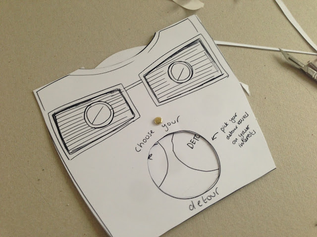
To promote the application to new tourists and to get people to start downloading and using the application I have decided to created a mail shot which can be mailed to tourists with there tickets for example for this can act as a leaflet to given out at tourist information centres. The idea of the viewmaster stems from the functionality within the app which works like a viewmaster when the user chooses there detour, therefore I have decided to translate this into a paper version as a way to promote the application.
Initially before designing the viewmaster I did some research into the visual aesthetic of the View Master and how it worked and looked so I had a point of reference for when I was designing my own. I gathered a selection of images from the internet as well as starting to develop and initial range of possible colours.
From here I created a Mock up of how my paper based view master would work, It consists of three pieces the front and back of the view master and the the middle section which moves round in a circular motion alike the view master.
The centre moving piece I have then affixed to the front panel to allow it to move freely.
These two pieces together are the affixed with double sided to the back piece, allowing the middle piece to still move freely.
Here you can see how the middle piece is moved by pulling it round via the open segment at the top.
Using the mock up and my initial research into the visuals of the viewmaster I have created my viewmaster using illustrator. The traditional view master is red in colour however my brand is based in the colour orange therefore I have made the viewmaster orange with a red tint to make sure the idea and concept still translates to the target audience.


Leave your comment