After working on a concept for the brand one paper I moved some of my successful ideas over digitally and began to work with them in Illustrator to see which ideas would be successful. I wanted to keep the logo simple and use a simple sans-serif typeface. I primarily worked with the positioning and layout of the type and letterforms to create meaning visually.
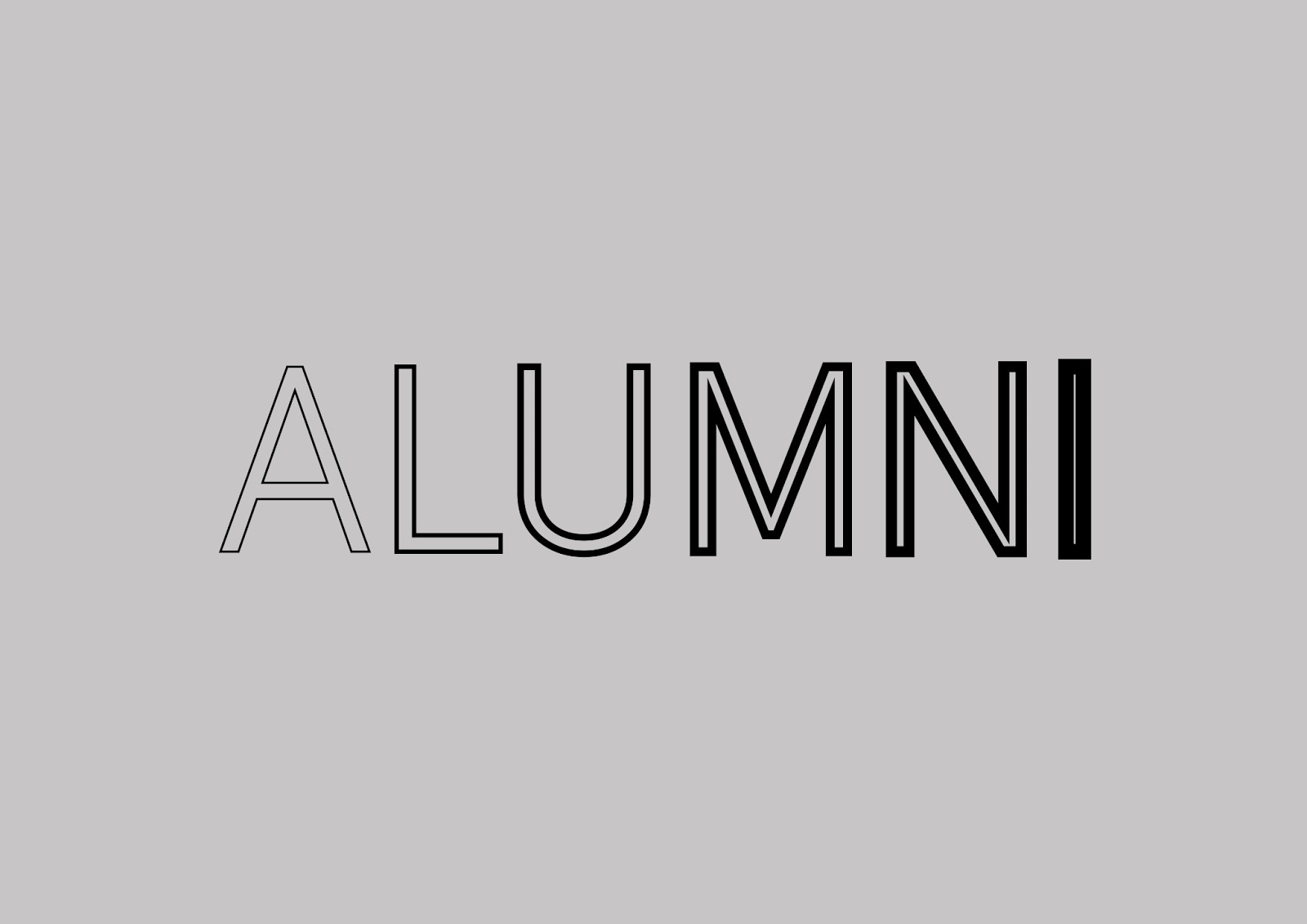
This idea stems from the concept of growth and the idea that the alumni grows in excellence and become a bigger community every year, conveyed throughout the growth in letterform weight.


These logos suggest a message of community through creating a ring with the letterforms as a circle or ring is symbolic of a connected community as well as growing community.

The i is highlighted within this logo throughout being in lowercase and creating contrast with the other letterforms to suggest the important of individual and that the individual as the Alumni is essentially a group of talent individual who come to together to form the alumni.


Further variant of placing dominance on the I letterform.


These logos work off the concept the Alumni grows but also grow to greater, bigger and better things but also suggest the idea that Alumni is stepping stone to greater things as well as the Alumni being a support network for current students.


Leave your comment