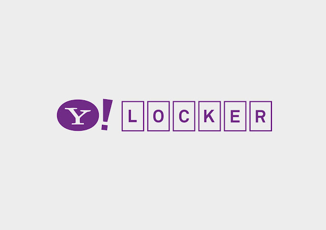
After reviewing the selection of concept I developed, I felt that the Yahoo Locker concept had the most substance as well as relating more to all the key points of the brand as well being the most relevant to the target audience. From here I began to look at developing a logo to associate with the communicate of this concept. I adapted a range of visual metaphors associated with lockers and combined them into logos.
These range of logo play on the metaphor of the combination lock found on many lockers. The logo is simple, clear and understandable, it suggests the personalised aspect to concept and brand, it also has scope for movement which could be considered when designed for digital media outputs.
To further communicate the locker concept I have placed a key hole within the O which suggests a locker but also a key, as the locker concept is also about unlocking your identity and unlocking your digital locker.
The letters are connected together to suggest the connected services that yahoo offer, but it doesn't communicate much of the 'locker' concept.
I have combined the two ideas together but the logo seems crowded and confusing.
A logo that links with the creation of a yahoo email address links with the goal of the brief to get new users to starting using yahoo mail, however this logo doesn't provide longevity to brand in the future, however this could be included in other artwork.


Leave your comment