
Within my crit it was suggested that I added more lines to more strongly convey and communicate the message that the lines signify rain, I think it has improved the communication however further work is needed as the lines at the top and bottom corners are small and make the design look less clean. I have also moved the subtext to the bottom of the posters so the hierarchy of type is more clear and less confusing for the audience as to which order the type is to be read in.

As the posters message is also about music it was also suggested I should focus more on conveying this idea, I had this idea of making the type look like sheet music, I have moved the main top up and down to mimic the displacement of music notes and fragmented the subtext to mimic the style of lyrics written beneath music notes. I don't think the design is successful as others but could provide a starting point for further development.


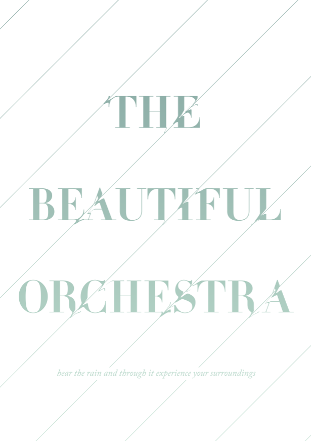
I have also gone back to this idea of how the rain distorts the environment, I have explored this idea in a different visual way than before as the line acts physically as the rain and distorts the type where it cuts though the type. Although I like the effect produced and it strongly conveys how rain distorts our otherwise 'perfect' world, the design as a whole is much less clean and furthermore is distortion a positive affect of rain?


I have also experimented with some more varied colour palettes as suggested within the crit all of which are mediocre in how successful they are, however I think the gradient type works well in conveying the downfall of rain I am trying to suggest visually however the colours need altering to be more effective.
Leave your comment